
Graphing Transit Systems, Part II – Centrality
This post is the second of three four looking into the graph structure of the New York City subway system. In the previous post, I discussed a frontend I built to visualize a depth-first search, breadth-first search, and shortest path algorithm. I ended with a discussion of centrality algorithms. We pick up our hero there…
Centrality metrics identify important nodes in a graph. In the gtfs-graph world, nodes represent subway stations. Why might we want to identify important stations in the NYC subway network? Honestly, my initial reason was I thought it sounded cool. I was curious to see if there are numbers (besides ridership…we’ll get to that in the next post!) to rank stations which align with our human perception of important stations in the system. Meaning: does the network structure indicate Times Square is a critical station, or is that just where the most riders board? That was the first question I wanted to explore. The next question would challenge the Lake Wobegon effect. That is: can all stations in a network be important?
To answer these questions, I created a web app for three cities and their heavy rail networks:
Each city has results for four centrality metrics: PageRank, Katz centrality, closeness centrality, and outward accessibility. I will be discussing the results in terms of the New York City network.
It is worth noting at this point that analyzing a transit network only using stops and edges is a very simplified model. To make any real decisions on the system as it relates to the city and population it serves, we would need to consider population density and employment centers at minimum. Knowing that, let’s proceed!
PageRank
If PageRank sounds familiar to you, it’s likely because it is the algorithm used by book publishers to identify pages, and definitely not because it was invented by Google co-founders Larry Page and Sergey Brin to rank web pages for their search engine. In this algorithm, a node’s importance is derived from the importance of all the nodes which link to it. Mapped over to transit, a station’s importance is derived from the importance of all the stations which have direct connections to it.
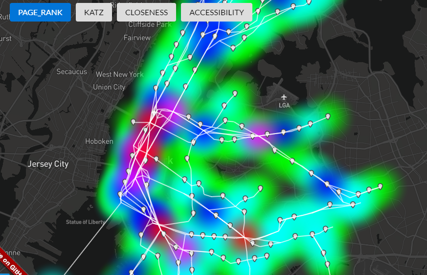
The PageRank results look interesting and definitely pick out important stations, but they do not give us insight into the entire distribution of stations.
I was giddy while implementing this and my brain swirled with grand visions of unlocking new insights to generations-old transit networks. As it turns out, PageRank is not a great model for a transit network. Let’s look at an example.
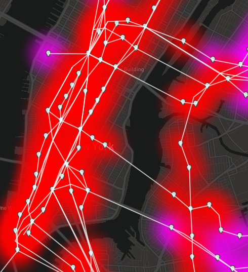
In the NYC PageRank view, you can see that Times Square comes out on top. Let’s collectively channel our inner undergrad physics lab student and breathe a sigh of relief that the numbers show us what we expected. Phewwwwwww. However, if we look at one of its neighbors, 34 St – 11 Av AKA the 7 train extension, we see that it ranks last. Not just maybe not top ten or top 100, but dead last. PageRank is saying that the 7 train extension produced a station that is literally the least important in the NYC network.
Have no fear Andrew Cuomo, let’s consider the model again. If you throw in sample numbers using the PageRank formula, you can see that the above behavior is correct. 34 St – 11 Av only has one “link” and that node’s PageRank is high, but it also has a high out-degree. Using the random surfer / random transit rider model, a rider passing through Times Square is not likely to end up at 34 St – 11 Av. Sorry 7 train, but PageRank is just does not do your $2.4 billion price tag justice. Let’s see how the other centrality metrics view the subway network!
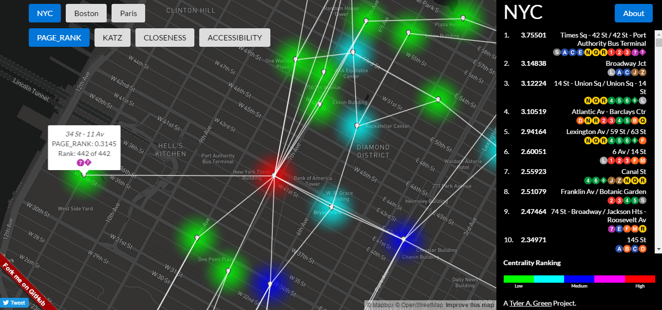
Poor 34 St – 11 Av doesn't get any love from PageRank. The data on the right shows the top 10 stations serve several subway routes each. This is not a coincidence; PageRank picks out highly connected nodes.
Katz Centrality
Katz Centrality builds on PageRank by considering all walks between two stops in a network, as opposed to only the shortest path between nodes. This appealed to me in a transit context because in a dense network such as Paris, there are often numerous routes between any two stops. This built-in redundancy has been brought up recently as a weakness of the DC metro during the on-going two-track vs. four-track debate and how it affects the maintenance window for a major heavy rail system.
Now is a good time to mention that I would highly recommend the Wikipedia entry for Katz centrality and all the metrics in this post. The original Katz paper is insightful as well.
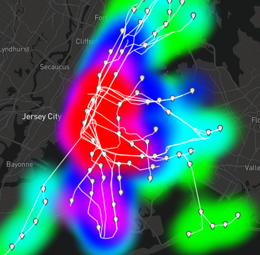
The results from Katz are……confusing. If you picked South Ferry as the most important MTA station, you either love platform extenders or misguidedly added the Staten Island Ferry to your subway network. The Staten Island Railway data is included in the MTA subway GTFS feed, so I kept it on my map. Closeness centrality (up next!) requires all nodes to be reachable from every other node, so I threw a fake edge in to the graph to represent the ferry. Believe me: the results were just as confusing before I added the ferry route. Due to the multiplicative nature of Katz centrality, the resulting distribution ranges from 0.00244 (Ozone Park – Lefferts Blvd) to 693,246.863 (St George, just across from South Ferry on the south-bound ferry).
Here’s all the insight I can offer on Katz centrality: all traffic between two well-connected sections of the graph (Staten Island and the entire rest of the MTA subway) has to pass through two stations: South Ferry and St George. Therefore, they are “important” and “central” and I am “confused” and “ready to talk about other metrics.”
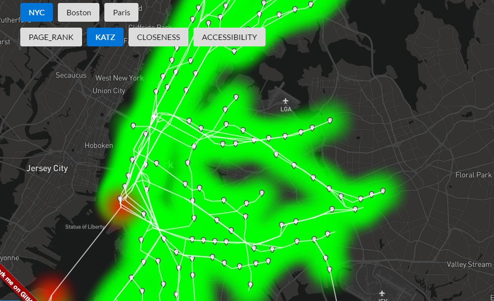
Katz says the subway network is equally unimpressive. Except for South Ferry. What a champ.
Closeness Centrality
My friend Calvin and I half made-up, half realized-it-was-already-a-thing, a centrality metric which promised a return to the fundamentals. Closeness centrality (or as Cal and I called it, the squiggly-doo) is intuitive in that the closer a node is to all other nodes, the more “central” it is. It does this by ranking a node by the sum of the shortest paths to all other nodes in the network. As you may remember from last post, the distance of each edge in our network is the number of seconds to travel via that route segment according to that system’s GTFS feed.
At this point of confusing results from two metrics, I discovered the term “node influence metrics.” These metrics seek to answer my second question from earlier: can all nodes in a network be important? PageRank and Katz identify important nodes, but only the top of their resulting distribution should be considered. This means the metric results for the bottom half of the distribution are more or less meaningless. Technically, closeness centrality is not a node influence metric, but I treat it as such. Intuition tells me that its results have meaning for the entire distribution of nodes. Please comment if you feel otherwise!
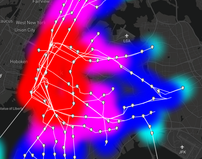
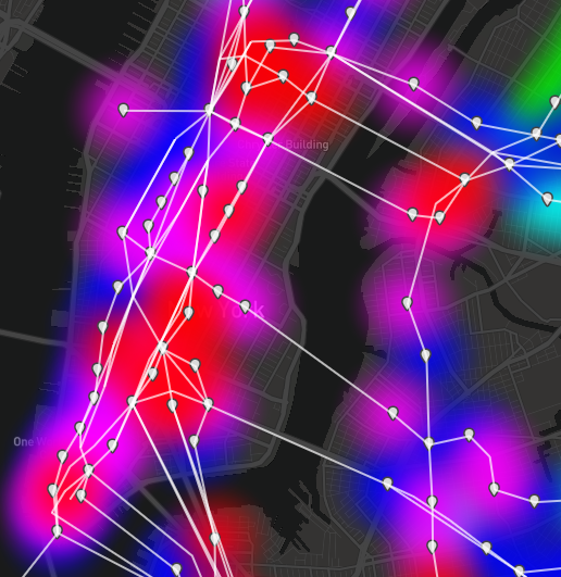
Neapolitan ice cream anyone? Closeness centrality results have no surprises.
Manhattan stations are ranked highly by closeness centrality. This uniformity is in contrast to the Manhattan results for outward accessibility.
The closeness centrality results are extremely straightforward. Subway stations on Manhattan score higher because riders can reach all other stations in less time there than elsewhere. The opposite is true for Far Rockaway. This algorithm will play an important role in the next post!
Outward Accessibility
Outward accessibility is one of the primary node influence metrics. It produces a normalized version of diversity entropy proposed in this paper by Travençolo and Costa. A node ranks highly when many unique paths can be taken from it over a course of random walks of varying distances. Sections of a graph which rank highly by this metric are found to have high network redundancy and high accessibility from the rest of the network. Redundancy and accessibility are both critical when evaluating a transit network, so this seemed like a good fit!
One drawback to the outward accessibility metric is performance and repeatability. Before calculating the actual metric, one must perform a series of random walks of varying distances from each node. For these walks to be representative, the walk count must be high, which can lengthen execution time of the analysis. Due to the nature of random calculations, the answers change every time! This could be solved by using a consistent random number generator seed when running the analysis, or by always running enough random walks for the results to converge.
Outward accessibility gives us the weather map appearance similar to closeness centrality, but are its individual stations ranked similarly?
Outward accessibility picks out hot spots of importance in a graph network. These can vary slightly due to the random nature of this algorithm, but should converge over time with enough random walks.
The results for outward accessibility appear to parallel those of closeness centrality at first glance. However, a closer look at the accessibility results shows hot spots. The metric tells us these are the nodes which allow riders to traverse the most unique routes in a given distance. Translated to the real world, this is valuable to the rider’s perception of a transit network. If I can go to 20 different stations within 10 subway stops (on any route), my location is better served by public transit than if I can only go to 10 stations within 10 stops.
Accessibility also has a strange property of ranking end stations higher. The logic is that if I start from the second from the end station, half of my random walks will go outwards and produce little diversity entropy. Conversely, if I start from the end station, all of my walks will go towards the potentially more diverse part of the graph. I emailed the paper authors to comment on this behavior, but have not heard back. If you are reading this, Travençolo or Costa, please comment with insight!
Next Stop
If you’ve hung with me this long and have noticed I haven’t answered either question posed at the start of this post, I’m going to grant you a short break. In the next post, we’ll discuss how the closeness centrality and outward accessibility results correlate to the NYC subway ridership numbers, as well as how these metrics compare between NYC and Paris. I hope you’ll stay on board!