
New York City Transit Depicted With (A New Set Of) Colorful Lines
Update 3/29/16: The transit visualization has been updated! The technical details in this post are still relevant, but some of the conclusions are no longer valid. Read about the updates here!
Stop the buses! Hold the phone! I now have visual proof that buses and subways in the Big Apple run more often on Fridays than Saturdays. How insightful, right? Okay, so maybe not, but I still enjoyed making a New York City transit frequency visualization using Transitland and Mapbox.
You can view the map here! Try hovering over each route and turning on different days and modes (subway versus bus) of service.
Below are a few images showing the difference in frequency of transit service on Friday and Saturday, followed by a discussion of each component of the project.
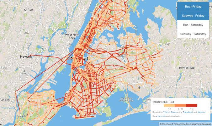
Friday morning subway and bus frequency. The coverage and frequencies are impressive!
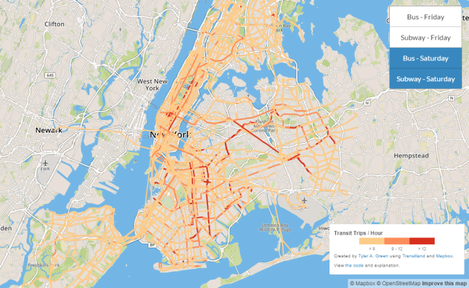
Saturday morning bus and subway service. As to be expected, the coverage is similar to on Friday, but the frequencies drop significantly.
What can we learn from this frequency visualization of New York City transit?
Some items this visualization illustrates are to be expected:
- Transit runs with higher frequencies during the week.
- Transit runs with higher frequencies in denser areas (Manhattan, Brooklyn) than less dense areas (Staten Island).
A few things made sense after seeing them, but were ideas I had not anticipated:
- Even in dense areas, bus frequencies are higher in areas that have less subway service, and vice versa. While this is true in Manhattan (more subways and subway frequency) and Brooklyn (more buses and bus frequency), it is quite noticeable in Queens. When you turn the subway layer off, western Queens appears almost devoid of transit. While its subway connections do not reach to the eastern edge of Queens, they do begin to make up for a lack of bus routes in western Queens. A few images below show this.
- The inter-borough connections between Queens and Brooklyn that are notoriously absent in all heavy rail maps of the area are almost as weak even when viewing bus data. It just isn’t easy to travel between Long Island’s two boroughs. Maybe the planned streetcar will finally help this.
One thing to keep in mind: the trips per hour numbers that appear when you hover over lines on the map are not specific to a transit route. They encompass all transit services, potentially multiple routes and even modes, between the two stops that create an edge.
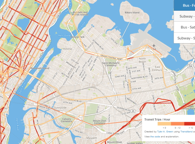
Bus routes in western Queens. Doesn't this seem like it's missing something?
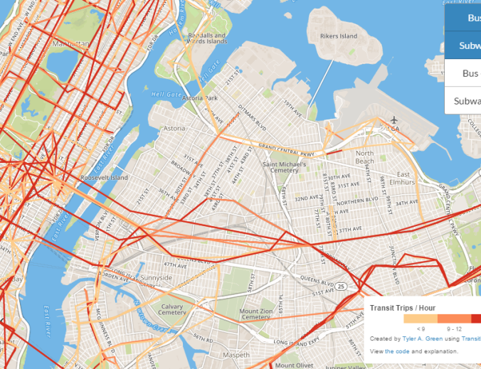
Bus and subway routes in western Queens. That's a bit better.
The Data
Transitland is an open source project that aggregates transit feeds from across the world. You can query its JSON API to create apps and visualizations easier than directly crunching the underlying GTFS data.
I was inspired to dig into Transitland by this similar frequency visualization for San Francisco. We both use the stops and schedule_stop_pairs API endpoints to calculate how often the “edge” between any two consecutive transit stops is visited in a given time frame.
I chose an appropriate bounding box to encompass all the transit stops operated by MTA and picked a window of 7:30am to 8:00am on the mornings of Friday, January 22, 2016, and Saturday, January 23, 2016. In addition to buses and subways, ferry service is also returned by Transitland in this bounding box, which explains the trips to Staten Island and oddly-direct routes to New Jersey.
The data returned by Transitland is not real-time data of actual transit performance, only the scheduled service times on those dates. I was able to extrapolate a “trips per hour” frequency metric by dividing the edge weight by the length of my query’s time frame.
The Map
I considered publishing a map using QGIS, but I was fortunate enough to stumble upon Mapbox. Mapbox does not have the analytical tools that QGIS does, but its ease of creating interactive web-based maps is impressive.
GeoJSON is a standard JSON variant that holds geographical information, such as points and line segments. In addition to its required fields, I loaded the GeoJSON output files with styling from Mapbox’s simplestyle-spec based on the frequency for that line segment. Mapbox interprets these “properties” fields when displays the data on a map.
A good tool should be simple enough to let you spend time solving real problems and I found Mapbox to reach this goal swimmingly (is there a similar term for transit??). The small amount of code needed to plot four GeoJSON files, toggle between them, show a map legend, and allow zooming and a loading screen all on top of a satisfactory OpenStreetsMap was remarkable. I will most definitely be using Mapbox for future transit projects!
The Code
As the JSON Transitland interface language-agnostic, any scripting language could be used. Ruby is by far my favorite, so I stuck with what I know. You can view the visualization in my GitHub repository. The code is divided into an HTML front-end and Ruby back-end, though they do not connect directly. A few ideas I have for the future of this project:
- The TransitlandAPIReader class could be generalized into a gem with a decent test suite, similar to one Transitland used to maintain and intends to bring back.
- The run.rb script could take a job spec input to produce GeoJSON files for multiple days and cities in a single run.
- The Mapbox front-end could be used to visualize any arbitrary transit system’s GTFS shape data. This would likely be done using a Rails back-end, rather than the offline Ruby script I am currently using.
Other News
I spent another few hours this week getting lost reading about the Cincinnati subway. If you haven’t dove into that tunnel of information before, I’d highly recommend it. Something about using an old canal which had become economically unfeasible due to competition from railroads to build a tunnel system that was halted due to a moratorium on capital bonds during World War I and never successfully revived just fascinates me. Seriously, any single part of that last sentence would make for a good story, but all those together create a sort transit tragedy worthy of a Shakespearean drama.
In the bed of the canal née Erie
doth thou venture to lay parallel rails.
To endure and inspire they began,
ere citizens above were admonished
their Sisyphean ambitions would fail.
I’m getting cold shivers just imagining a chorus reciting that at the opening of a transit conference. Please let me know of any other examples of transit stories told in iambic pentameter.
Until next time, ride on!